CSS로 "액체 육각형"을 만들 수 있습니까?
TCS
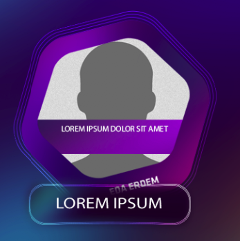
아래 디자인을 공유하고 있습니다.
그리고 내 코드 :
https://jsfiddle.net/09h5coq8/
.hex {
        position: relative;
        margin: 1em auto;
        width: 200px;
        height: 346.4px;
        border-radius: 20px/10px;
        background: rgb(139,21,186);
        background: linear-gradient(70deg, rgba(139,21,186,1) 0%, rgba(64,13,104,1) 100%);
        background-size:cover;
        transition: opacity .5s;
        transform: rotate(20deg);
        margin-top:125px;
        }
        .hex:before, .hex:after {
        position: absolute;
        width: inherit; height: inherit;
        border-radius: inherit;
        background: inherit;
        content: '';
        }
        .hex:before {
            -webkit-transform: rotate(60deg);
            transform: rotate(60deg);
            background: linear-gradient(180deg, rgba(139,21,186,1) 0%, rgba(64,13,104,1) 100%);
        }
        .hex:after {
            -webkit-transform: rotate(-60deg);
            transform: rotate(-60deg);
            background: linear-gradient(-50deg, rgba(139,21,186,1) 0%, rgba(64,13,104,1) 100%);
        }
       .hex-inside {
        position: absolute;
        width: 150px;
        height: 259.8px;
        border-radius: 15px/7.5px;
        background: grey;
        transition: opacity .5s;
        z-index:99;
        left:25px;
        top:43.3px;
        }
        .hex-inside:before, .hex-inside:after {
        position: absolute;
        width: inherit; height: inherit;
        border-radius: inherit;
        background: inherit;
        content: '';
        }
        .hex-inside:before {
            -webkit-transform: rotate(60deg);
            transform: rotate(60deg);
        }
        .hex-inside:after {
            -webkit-transform: rotate(-60deg);
        transform: rotate(-60deg);
        }


<div class="hex">
        <div class="hex-inside">

        </div>
    </div>
보시다시피, 내 코드에는 더 많은 "날카로운 모서리"가 깨진 "그라데이션"과 느낌이 충분하지 않습니다. 뭐가 문제 야?
"순수한 CSS와 자바 스크립트"로 어떻게 이것이 가능할 수 있습니까?
SVG로 만들어야합니까?
Afif 동반
여기 내 사용하여 생각 clip-path하고 끈적 끈적한 필터 :
.box {
  width: 300px; /* adjust this to control the size of the shape */
  margin: 20px;
  transform:rotate(-20deg);
}

.box,
.box > div > div{
  filter: url('#goo'); /* the SVG filter (adjust the "stDeviation" value to control the radius) */
}

.box > div {
  padding: 20px; /* thickness of the gradient */
  /* your gradient here */
  background: linear-gradient(70deg, rgba(139,21,186,1), rgba(64,13,104,1), rgba(139,21,186,1));
}

.box > div,
.box > div > div > div {
  /* hexagon shape (https://bennettfeely.com/clippy/) */
  clip-path: polygon(25% 0%, 75% 0%, 100% 50%, 75% 100%, 25% 100%, 0% 50%);
}

.box > div > div > div  {
  padding-top: 91%; /* keep the ratio of the shape */
}

.box > div > div > div::before {
  content:"";
  position:absolute;
  top:-10%;
  left:-10%;
  right:-10%;
  bottom:-10%;
  background:url(https://picsum.photos/id/1069/800/800) center/cover;
  transform:rotate(20deg); /* rotate the image back */
}

* {
  box-sizing: border-box;
}
<div class="box">
<div>
<div>
<div></div>
</div>
</div>
</div>
<svg style="visibility: hidden; position: absolute;" width="0" height="0" xmlns="http://www.w3.org/2000/svg" version="1.1">
<defs>
<filter id="goo"><feGaussianBlur in="SourceGraphic" stdDeviation="8" result="blur" />
<feColorMatrix in="blur" mode="matrix" values="1 0 0 0 0 0 1 0 0 0 0 0 1 0 0 0 0 0 19 -9" result="goo" />
<feComposite in="SourceGraphic" in2="goo" operator="atop"/>
</filter>
</defs>
</svg>이 기사는 인터넷에서 수집됩니다. 재 인쇄 할 때 출처를 알려주십시오.
침해가 발생한 경우 연락 주시기 바랍니다[email protected] 삭제
에서 수정
관련 기사
Related 관련 기사
- 1
CSS로 곡선 파선을 만들 수 있습니까?
- 2
CSS3만으로이 특정 모양을 만들 수 있습니까?
- 3
릴리스 설명을 필수로 만들 수 있습니까?
- 4
"상대"변수로 HashMap을 만들 수 있습니까?
- 5
HTML / CSS로 데이터 토글을 어떻게 만들 수 있습니까?
- 6
CSS로 숫자에 대한 이중 윤곽선을 만들 수 있습니까?
- 7
html 및 css로 메뉴 템플릿을 만들 수 있습니까?
- 8
Swift-프로토콜을 Hashable로 만들 수 있습니까?
- 9
while 루프로 레이블을 만들 수 있습니까?
- 10
모듈 이름을 대문자로 만들 수 있습니까?
- 11
Joi로 이중 연결 목록을 만들 수 있습니까?
- 12
kotlin으로 풀 스택 웹앱을 만들 수 있습니까?
- 13
PostgreSQL로 2D json 배열을 만들 수 있습니까?
- 14
단일 HTML 파일로 양식을 만들 수 있습니까?
- 15
JavaScript로 LinkedHashMap을 만들 수 있습니까?
- 16
식을 constexpr로 만들 수 있습니까?
- 17
SVG로 캘리 그래피 룩을 만들 수 있습니까?
- 18
SVG로 캘리 그래피 룩을 만들 수 있습니까?
- 19
tmux 창을 "고정"으로 만들 수 있습니까?
- 20
로딩 화면을 만들 수 있습니까
- 21
cron을 "무작위"로 만들 수 있습니까?
- 22
Union을 템플릿으로 만들 수 있습니까?
- 23
OpenGL 1로 Kivy 앱을 만들 수 있습니까?
- 24
wxDataViewCtrl atuo 스크롤을 buttom으로 만들 수 있습니까?
- 25
콘솔을 전체 화면으로 만들 수 있습니까?
- 26
콘솔을 전체 화면으로 만들 수 있습니까?
- 27
echo $ _GET으로 폼 액션을 만들 수 있습니까?
- 28
무엇을 가짜로 만들 수 있습니까?
- 29
if 문으로 2 개의 where 절을 만들 수 있습니까?
몇 마디 만하겠습니다