CSS에서 반원형 그리기
FryingggPannn
모양을 복제하려고합니다
CSS에서 둥근 모양을 사용하면 약간 다르게 보입니다.
.shape{
display: inline-block;
text-align: center;
line-height: 18px;
border-radius: 9px 9px 9px 9px;
color: #000000;
padding-left: 6px;
padding-right: 6px;
font-weight: bold;
font-family: sans-serif;
}
.shape.orange{
background-color: #FF931B;
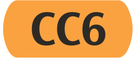
}<span class="shape orange">CC6</span>올바른 모양을 얻으려면 어떻게해야합니까?
Afif 동반
이것은 다음을 사용하여 수행 할 수 있습니다. radial-gradient
.shape{
  display: inline-block;
  font-size:50px;
  line-height:1.5em;
  padding:0 0.4em;
  font-weight: bold;
  font-family: sans-serif;
  background:
    radial-gradient(100% 50% at right, #FF931B 98%,transparent 100%) left,
    radial-gradient(100% 50% at left , #FF931B 98%,transparent 100%) right,
    #FF931B content-box; /*Don't color the padding to keep it for radial-gradient*/
  background-size:0.4em 100%; /* Width same as padding and height 100%*/
  background-repeat:no-repeat;
}
<span class="shape">CC6</span>
<span class="shape" style="font-size:70px">CC6</span>
<span class="shape" style="font-size:15px">CC6</span>또는 border-radius아래와 같이 :
.shape{
  display: inline-block;
  font-size:50px;
  line-height:1.5em;
  padding:0 0.4em;
  font-weight: bold;
  font-family: sans-serif;
  background:  #FF931B;
  border-radius:0.4em/50%;
}
<span class="shape">CC6</span>
<span class="shape" style="font-size:70px">CC6</span>
<span class="shape" style="font-size:15px">CC6</span>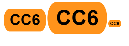
이 기사는 인터넷에서 수집됩니다. 재 인쇄 할 때 출처를 알려주십시오.
침해가 발생한 경우 연락 주시기 바랍니다[email protected] 삭제
에서 수정
관련 기사
Related 관련 기사
- 1
R에 반원 그리기
- 2
Tableau에서 원형 차트 그리기
- 3
R에서 원 그리기
- 4
반응 형 CSS 그리드 만들기
- 5
정점 위치에서 원형 표시 그리기
- 6
자바에서 원과 직사각형 그리기
- 7
highcharts의 배열에서 원형 차트 그리기
- 8
MATLAB에서 타원형 포물선 그리기
- 9
Python에서 타원형 궤도 그리기 (numpy, matplotlib 사용)
- 10
WPF에서 확장 가능한 원형 브래킷 그리기
- 11
CSS 3에서 호가있는 원 그리기
- 12
파이 게임에서 반원 그리기
- 13
원에 점 그리기
- 14
JFrame에 원 그리기
- 15
Vuetify에서 반응 형 카드 그리드 만들기
- 16
iOS에서 반투명 직사각형 그리기
- 17
다차원 맵 반복기에서 유형 변환
- 18
Flutter에서 원 메뉴 그리기
- 19
R에서 일련의 원 그리기
- 20
R에서 원의 호 그리기
- 21
pyqtgraph에서 직사각형 그리기
- 22
JForm Java에서 도형 그리기
- 23
CSS로 반응 형 그리드 만들기 (100 % x 100 %)
- 24
CSS를 사용하여 반 수직 타원형 만들기
- 25
iOS에서 애니메이션으로 반원형 차트 (반원)를 그리는 세 번째 라이브러리가 있습니까?
- 26
Chartjs 문제로 도넛 중간에 원형 세그먼트 비율 그리기
- 27
투명한 창에 반투명 직사각형 그리기
- 28
사용자 입력을 기반으로 Google Maps V2에 원 그리기
- 29
WPF에서 GDI 그래픽으로 원 그리기
몇 마디 만하겠습니다