サイドナビゲーションプライマリコンテンツエリア内のマット拡張パネル内にマットカードをレンダリングするにはどうすればよいですか?
PCorruthers
マテリアルコンポーネントを使用したAngular6プロジェクト。これは内部使用のための小さなウェブサイトです。目的は、外部リソースにリンクすることです。各リソースはカードで表され、拡張パネルに分類したいと思います。しかし、私は望ましい効果を達成することができません。
開いた拡張パネル:
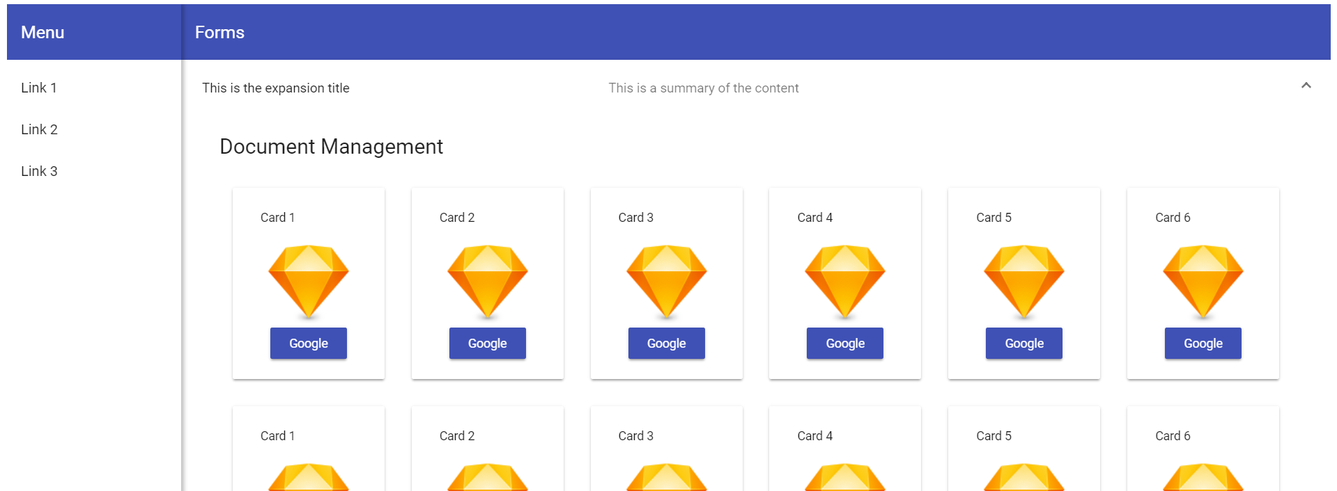
拡張パネルが閉じています:

ご覧のとおり、拡張パネルが開閉すると、画面全体に影響を与えます。
ダッシュボードコンポーネントHTML
<div class="grid-container">
  <h1 class="mat-h1">Document Management</h1>
  <mat-grid-list cols="6" rowHeight="250px">
    <mat-grid-tile *ngFor="let card of cards" [colspan]="card.cols" [rowspan]="card.rows">
      <mat-card class="dashboard-card">
        <mat-card-header>
          <mat-card-title>
            {{card.title}}
          </mat-card-title>
        </mat-card-header>
        <mat-card-content class="dashboard-card-content">
           <img src="https://www.sketchapp.com/images/app-icon.png">
          <a mat-raised-button color="primary" onClick="window.open('//google.com')">Google</a>
        </mat-card-content>
      </mat-card>
    </mat-grid-tile>
  </mat-grid-list>
</div>

</mat-expansion-panel>
ダッシュボードコンポーネントCSS
.grid-container {
  margin: 20px;
}

.dashboard-card {
  position: absolute;
  top: 15px;
  left: 15px;
  right: 15px;
  bottom: 15px;
  max-height: 180px;
}

.more-button {
  position: absolute;
  top: 5px;
  right: 10px;
}

.dashboard-card-content {
  text-align: center;
}
ダッシュボードコンポーネントTS
import { Component } from '@angular/core';

@Component({
  selector: 'irgdashboard',
  templateUrl: './irgdashboard.component.html',
  styleUrls: ['./irgdashboard.component.css']
})
export class IRGDashboardComponent {
  cards = [
    { title: 'Card 1', cols: 1, rows: 1 },
    { title: 'Card 2', cols: 1, rows: 1 },
    { title: 'Card 3', cols: 1, rows: 1 },
    { title: 'Card 4', cols: 1, rows: 1 },
    { title: 'Card 5', cols: 1, rows: 1 },
    { title: 'Card 6', cols: 1, rows: 1 },
    { title: 'Card 1', cols: 1, rows: 1 },
    { title: 'Card 2', cols: 1, rows: 1 },
    { title: 'Card 3', cols: 1, rows: 1 },
    { title: 'Card 4', cols: 1, rows: 1 },
    { title: 'Card 5', cols: 1, rows: 1 },
    { title: 'Card 6', cols: 1, rows: 1 },
  ];
}
サイドナビゲーションコンポーネントHTML
<mat-sidenav-container class="sidenav-container">
  <mat-sidenav
    #drawer
    class="sidenav"
    fixedInViewport="false"
    [attr.role]="(isHandset$ | async) ? 'dialog' : 'navigation'"
    [mode]="(isHandset$ | async) ? 'over' : 'side'"
    [opened]="!(isHandset$ | async)">
    <mat-toolbar color="primary">Menu</mat-toolbar>
    <mat-nav-list>
      <a mat-list-item href="#">Link 1</a>
      <a mat-list-item href="#">Link 2</a>
      <a mat-list-item href="#">Link 3</a>
    </mat-nav-list>
  </mat-sidenav>
  <mat-sidenav-content>
    <mat-toolbar color="primary">
      <button
        type="button"
        aria-label="Toggle sidenav"
        mat-icon-button
        (click)="drawer.toggle()"
        *ngIf="isHandset$ | async">
        <mat-icon aria-label="Side nav toggle icon">menu</mat-icon>
      </button>
      <span>Forms</span>
    </mat-toolbar>
    <irgdashboard></irgdashboard>
  </mat-sidenav-content>
</mat-sidenav-container>
サイドナビゲーションコンポーネントCSS
.sidenav-container {
  height: 100%;
}

.sidenav {
  width: 200px;
  box-shadow: 3px 0 6px rgba(0,0,0,.24);
}
サイドナビゲーションTS
import { Component } from '@angular/core';
import { BreakpointObserver, Breakpoints, BreakpointState } from '@angular/cdk/layout';
import { Observable } from 'rxjs';
import { map } from 'rxjs/operators';

@Component({
  selector: 'irgsidenav',
  templateUrl: './irgsidenav.component.html',
  styleUrls: ['./irgsidenav.component.css']
})
export class IRGSidenavComponent {

isHandset$: Observable<boolean> = this.breakpointObserver.observe(Breakpoints.Handset)
    .pipe(map(result => result.matches));

  constructor(private breakpointObserver: BreakpointObserver) {}

  }
アプリコンポーネントのHTML
<irgsidenav></irgsidenav>
私はAngularを使用したWebアプリケーションの開発に飛び込み始めたばかりで、単純なものが欠けている可能性があると考えています。追加情報が必要な場合はお知らせください。どんな入力でも大歓迎です。
G.トランター
あなたのように見えirgdashboard要素が全体のメインのコンテンツ領域であり、それが唯一の拡張リストが含まれています。これにより、アプリケーションの高さが拡張リストの高さに追従し、問題が発生します。メインコンテンツ領域は、常に(100%)アプリケーションの高さ全体(ツールバーの下)を占めるように拡張されるDIVまたはその他の要素である必要があります。次に、拡張リストをそのコンテナーに追加します。展開と折りたたみによってアプリのサイズが変更されることはありません。
この記事はインターネットから収集されたものであり、転載の際にはソースを示してください。
侵害の場合は、連絡してください[email protected]
編集
コメントを追加