cssフレックスボックスでスライダーレイアウトを作成するにはどうすればよいですか?
irbgls
この写真のように、フレックスボックスを使用してスライダーレイアウトを作成しようとしています。
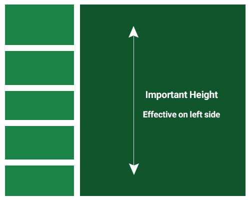
右側に大きな写真、左側にサムネイルアイテムがあります。左側とサムネイルラッパーを写真の高さに合わせたい。しかし残念ながら、それはフレックスボックスだけでは不可能であり、JavaScriptで大きな写真の高さを確認し、左側をそれに合わせる必要があります。
たとえば、次のコードを確認してください。
main{
    position: absolute;
    top: 0px;
    left: 0px;
    right: 0px;
    bottom: 0px;
    display: flex;
    align-items: center;
    justify-content: center;
}

.wrapper{
    width: 500px;
    overflow: hidden;
    background: gray;
    display: flex;
    align-items: flex-start;
    justify-content: center;
}

.right{
    width: calc(100% - 150px);
    height: 450px;
    background: red;
}

.left{
    width: 150px;
    display: flex;
    align-items: center;
    justify-content: space-between;
    flex-direction: column;
}

.item{
    width: 100%;
    height: 50px;
    color: white;
    background: green;
    display: flex;
    align-items: center;
    justify-content: center;
}
<main>
<div class="wrapper">
<div class="left">
<div class="item">
<strong>Item</strong>
</div>
<div class="item">
<strong>Item</strong>
</div>
<div class="item">
<strong>Item</strong>
</div>
<div class="item">
<strong>Item</strong>
</div>
<div class="item">
<strong>Item</strong>
</div>
</div>
<div class="right"></div>
</div>
</main>サンプルコードでは、画像を作成しておらず、CSSで450pxの高さでこの問題を処理しました。
では、どうすれば左側をJSなしで、CSSのみで位置合わせできますか?space-betweenモードを使用して、この高さのすべてのアイテムを表示したいと思います。考えてみてくださいheight:100%、この問題では機能しませんでした。
ピート
私のコメントによると、左の列を右の列の高さまで拡張するには、ラッパーから整列アイテムを削除するだけです。
main{
    position: absolute;
    top: 0px;
    left: 0px;
    right: 0px;
    bottom: 0px;
    display: flex;
    align-items: center;
    justify-content: center;
}

.wrapper{
    width: 500px;
    overflow: hidden;
    background: gray;
    display: flex;
    /* align-items: flex-start; -- remove this */
    justify-content: center;
}

.right{
    /* width: calc(100% - 150px);  I would swap this for flex grow, then you don't need hard values */
    flex-grow: 1;
    height: 450px;
    background: red;
}

.left{
    width: 150px;
    display: flex;
    align-items: center;
    justify-content: space-between;
    flex-direction: column;
}

.item{
    width: 100%;
    height: 50px;
    color: white;
    background: green;
    display: flex;
    align-items: center;
    justify-content: center;
}
<main>
<div class="wrapper">
<div class="left">
<div class="item">
<strong>Item</strong>
</div>
<div class="item">
<strong>Item</strong>
</div>
<div class="item">
<strong>Item</strong>
</div>
<div class="item">
<strong>Item</strong>
</div>
<div class="item">
<strong>Item</strong>
</div>
</div>
<div class="right"></div>
</div>
</main>この記事はインターネットから収集されたものであり、転載の際にはソースを示してください。
侵害の場合は、連絡してください[email protected]
編集
- 前の投稿:Pyspark:列に別の列の文字列が含まれている場合にデータフレームをフィルタリングします(SQL LIKEステートメント)
- 次の投稿:AndroidはLiveData <>をListViewに割り当てます
関連記事
Related 関連記事
- 1
CSSボックスレイアウトを作成するにはどうすればよいですか?
- 2
条件付きフレックスダッシュボードレイアウトを作成するにはどうすればよいですか
- 3
33%/ 33%/ 33%/ 100%/ 100%フレックスボックスレイアウトを作成するにはどうすればよいですか?
- 4
(CSSフレックスボックスを使用して)このレイアウトを取得するにはどうすればよいですか?
- 5
CSSを使用してフレックスレイアウトで四角いボタンを取得するにはどうすればよいですか?
- 6
セシウムをフレックスボックスレイアウトで動作させるにはどうすればよいですか?
- 7
ボットフレームワークMessagesControllerで現在のダイアログスタックを解決するにはどうすればよいですか?
- 8
フレックスボックススライダーで乗算画像を正しく表示するにはどうすればよいですか?
- 9
ボーダーレイアウトの北にクラスインスタンスを配置するにはどうすればよいですか?
- 10
レイアウトグループボックスヘッダーの下の境界線を削除するにはどうすればよいですか?
- 11
Tableauダッシュボードでレスポンシブレイアウトを作成するにはどうすればよいですか?
- 12
ネストされたフレックスボックスの列レイアウトで画像スケーリング効果を作成するにはどうすればよいですか?
- 13
CSSグリッドレイアウトでスティッキーフッターを作成するにはどうすればよいですか?
- 14
2行でアイテムを2つのサブ列にグループ化したフレックスボックスレイアウトを作成するにはどうすればよいですか?
- 15
ボックスを使用してテキスト入力レイアウトを作成するにはどうすればよいですか?
- 16
セレンウェブドライバーで「マットチェックボックス」を選択するにはどうすればよいですか?
- 17
アラート ボックスまたはダイアログ ボックスでクリック可能なリンクを使用してアラート ボックスを作成するにはどうすればよいですか?
- 18
スタックビューを使用してラベルとボタンを自動レイアウトするにはどうすればよいですか?
- 19
コマンドラインからファイル/ディレクトリパスを選択するようにGUIダイアログボックスでユーザーに促すにはどうすればよいですか?
- 20
コマンドラインからファイル/ディレクトリパスを選択するようにGUIダイアログボックスでユーザーに促すにはどうすればよいですか?
- 21
Windowsで複数のIPアドレスを持つWebサイトへのトラフィックをブロックまたはファイアウォールで遮断する関数を作成するにはどうすればよいですか?
- 22
フレックスを使用して異なる数の列レイアウトを作成するにはどうすればよいですか?
- 23
プレーヤークラスで、プレーヤーの子としてヒットボックススプライトを作成しました。gamesceneのdidBeginメソッドでそのヒットボックススプライトにアクセスするにはどうすればよいですか?
- 24
フレックスボックス内でスクロール可能なフルハイトdivを取得するにはどうすればよいですか?
- 25
ドロップダウンリストを含むHTMLダイアログボックスを作成するにはどうすればよいですか?
- 26
発信トラフィックを別のアドレスにリダイレクトするにはどうすればよいですか?
- 27
スクロールレイアウトを作成するにはどうすればよいですか?
- 28
フレックスボックスアイテムの子孫要素をスクロール可能にするにはどうすればよいですか?
- 29
モバイルデバイスにスタックするボタンをレイアウトするにはどうすればよいですか?
コメントを追加