デバイス間で同じ場所のImageView内にTextViewを配置するにはどうすればよいですか?
ダニエル・ヨルゲンセン:
この図面のように、ImageViewの特定の場所の上にTextViewを配置する必要があるImageViewがあります。
私はなんとか次のxmlを使用してこれを行うことができました:
<androidx.constraintlayout.widget.ConstraintLayout
    android:layout_width="match_parent"
    android:layout_height="wrap_content">

    <ImageView
        android:id="@+id/background"

        android:adjustViewBounds="true"
        android:layout_width="wrap_content"
        android:layout_height="wrap_content"
        android:scaleType="centerInside"
        android:src="@drawable/imageBg"
        app:layout_constraintEnd_toEndOf="parent"
        app:layout_constraintLeft_toLeftOf="parent"
        app:layout_constraintStart_toStartOf="parent"
        app:layout_constraintTop_toTopOf="parent" />

    <TextView
        android:layout_width="wrap_content"

        android:layout_height="wrap_content"
        android:text="Test text"

        android:textColor="#ff0000"

        android:layout_marginRight="200dp"
        android:layout_marginTop="205dp"


        app:layout_constraintLeft_toLeftOf="@id/background"
        app:layout_constraintRight_toRightOf="@id/background"
        app:layout_constraintTop_toTopOf="@id/background" />

</androidx.constraintlayout.widget.ConstraintLayout>
これは私の1つのエミュレーターテストデバイスで正常に機能しますが、他のエミュレーターデバイスで試したときに予想したように、固定マージンのdp値のため、異なる解像度などを実行する複数のデバイス間でうまくスケーリングしません。
複数のデバイス間で機能し、TextViewが常に同じ位置にあるようにするには、どうすればこれを最良の方法で実現できますか?私はdimens.xmlを利用し、そこで異なるデバイスディメンションに異なるマージン値を使用できることを知っていますが、これが最善のアプローチであるとは思いません。
タミール・アブトブル:
私はdimens.xmlを利用し、そこで異なるデバイスディメンションに異なるマージン値を使用できることを知っていますが、これが最善のアプローチであるとは思いません。
正しいです。次のようなガイドラインを使用して、レイアウトが異なる画面で同じように見えるようにすることができます。
<?xml version="1.0" encoding="utf-8"?>
<androidx.constraintlayout.widget.ConstraintLayout
  xmlns:android="http://schemas.android.com/apk/res/android"
  xmlns:app="http://schemas.android.com/apk/res-auto"
  xmlns:tools="http://schemas.android.com/tools"
  android:layout_width="match_parent"
  android:layout_height="match_parent">

<ImageView
    android:id="@+id/imageView2"
    android:layout_width="0dp"
    android:layout_height="0dp"
    android:scaleType="fitXY"
    app:layout_constraintBottom_toBottomOf="parent"
    app:layout_constraintEnd_toEndOf="parent"
    app:layout_constraintHeight_percent="0.4"
    app:layout_constraintStart_toStartOf="parent"
    app:layout_constraintTop_toTopOf="parent"
    app:layout_constraintWidth_percent="0.8"
    tools:srcCompat="@tools:sample/backgrounds/scenic" />

<androidx.constraintlayout.widget.Guideline
    android:id="@+id/guideline2"
    android:layout_width="wrap_content"
    android:layout_height="wrap_content"
    android:orientation="horizontal"
    app:layout_constraintGuide_percent="0.5"/>


<androidx.constraintlayout.widget.Guideline
    android:id="@+id/guideline3"
    android:layout_width="0dp"
    android:layout_height="wrap_content"
    android:orientation="vertical"
    app:layout_constraintGuide_percent="0.45"/>

<TextView
    android:id="@+id/textView7"
    android:layout_width="0dp"
    android:layout_height="0dp"
    android:background="@color/colorAccent"
    app:layout_constraintHeight_percent="0.1"
    app:layout_constraintWidth_percent="0.2"
    android:text="TextView"
    app:layout_constraintBottom_toTopOf="@+id/guideline2"
    app:layout_constraintEnd_toStartOf="@+id/guideline3" />

</androidx.constraintlayout.widget.ConstraintLayout>
これは次のようになります(黒い矢印はガイドラインです):
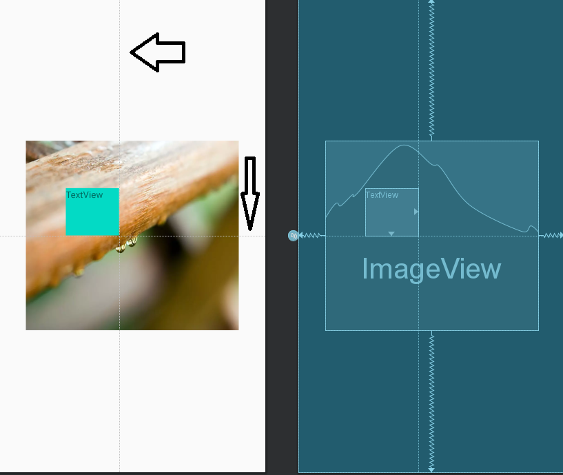
これでレイアウトは1つだけになりましたが、レスポンシブレイアウトです。さまざまなデバイス用に追加でレイアウトを作成する必要はありません。
私のビューには固定サイズがないことに注意してください。パーセンテージを使用して完全にレスポンシブなレイアウトを作成しました。この件について詳しくは、私の回答を確認してください。
この記事はインターネットから収集されたものであり、転載の際にはソースを示してください。
侵害の場合は、連絡してください[email protected]
編集
- 前の投稿:RxJSサブスクライブで矢印関数と次のメソッド引数を省略できるのはなぜですか?
- 次の投稿:Dockerfileはローカルでビルドされますが、Azure DevopsパイプラインのCOPYステップで失敗します
関連記事
Related 関連記事
- 1
ツールバーのタイトルと同じ場所にTextViewを追加するにはどうすればよいですか?
- 2
divが同じ場所にある間に、テキストをdiv内で折り返すにはどうすればよいですか?
- 3
スライドショーの矢印を中央に配置するにはどうすればよいですか?両方の間に100pxの距離を残し、異なる幅で同じ場所にとどまる
- 4
デバイスの最後の場所を取得するにはどうすればよいですか?
- 5
LinearLayoutの同じ行にImageviewとTextviewを設定するにはどうすればよいですか?
- 6
Word文書内の同じ文書内の別の場所へのハイパーリンクを作成するにはどうすればよいですか?
- 7
同じ場所に2つのdesktop.iniファイルを配置するにはどうすればよいですか?
- 8
リスト内のサブリスト間で同じインデックス位置の値を比較するにはどうすればよいですか?
- 9
SpriteKitの異なるデバイス間でSKSpriteNodeの速度を同じにするにはどうすればよいですか?
- 10
特定のデバイスが常に同じデバイスファイルを使用するようにするにはどうすればよいですか?
- 11
同じ列から複数の場所でIQueryableを作成するにはどうすればよいですか?
- 12
解像度/スケールに関係なく、画像を常にまったく同じ場所に配置するにはどうすればよいですか?
- 13
整数をバイト配列内の特定の場所に配置するにはどうすればよいですか?
- 14
異なるデバイスで同じ結果を得るにはどうすればよいですか?
- 15
マングースの.catchブロックは、複数の場所で同じです。これを回避するにはどうすればよいですか?
- 16
2つのデバイスが同時に同じ周波数でwifi信号を発信し、同時にアンテナに到達する場合、データが重複しないようにするにはどうすればよいですか?
- 17
リスト内の同じアイテムを削除するにはどうすればよいですか
- 18
アプリをすべてのデバイスで同じように表示するにはどうすればよいですか?
- 19
デバイスの場所に基づいてデータベース列を更新するにはどうすればよいですか?
- 20
リスト内のインデックスの文字列を分割し、同じリスト内に保存するにはどうすればよいですか?
- 21
cssのすべてのデバイスでボタンが同じように見えるようにするにはどうすればよいですか?
- 22
実行時にReact NativeでAndroidデバイスの場所の許可をリクエストするにはどうすればよいですか?
- 23
リスト内のテキストの後にボタンを配置して、同じ列に配置するにはどうすればよいですか?
- 24
同じテンプレートまたは別の場所でAjax成功データを使用するにはどうすればよいですか?
- 25
2つの要素を同じシーケンスに配置するにはどうすればよいですか?
- 26
同じ行に複数のリストを配置するにはどうすればよいですか?
- 27
同じ行に複数のスパンを配置するにはどうすればよいですか?
- 28
HTMLの同じ行にテキストを配置するにはどうすればよいですか?
- 29
Googleの場所の場所をdjangoモデルに保存するにはどうすればよいですか?
コメントを追加