Bootstrap Row spacing issue
Jofairden
So basically I want to have 2 extra panels show up on the left and right on md and higher, but hide it when on sm and xs. The hiding works fine, but not the showing.
They do show up on the left and right, but the problem is the spacing between the crumbs and navigation. The crumbs get pushed down as I add content to the right panel. When I add to the left panel it gets pushed to the side..
Nothing on the left but something on the right is the same as the first picture
Here's what I mean: 

I need it to be on the third picture so that crumbs stay right below nav.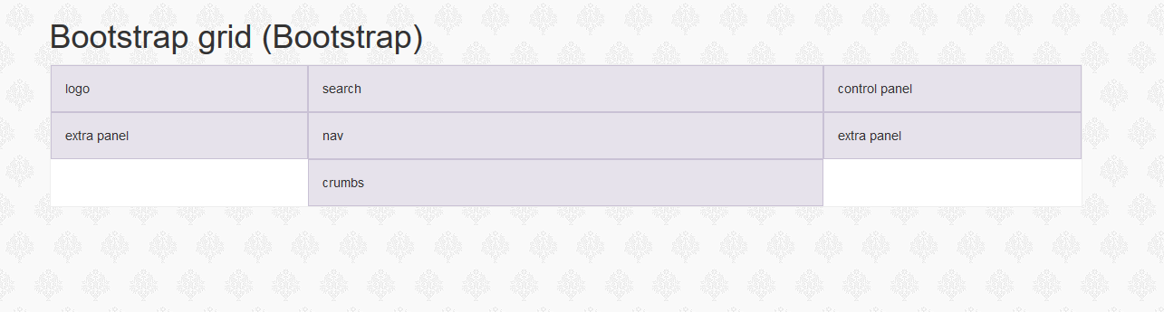
Here's my code:
        <div class="container">
        <h1>Bootstrap grid (Bootstrap)</h1>
        <div class="site-box">
            <div class="container-fluid">

                <div class="row">

                    <!-- HEADER -->
                    <!-- Logo -->
                    <div class="col-xs-4 col-md-3">
                        logo
                    </div>

                    <!-- Search -->
                    <div class="col-xs-8 col-md-6">
                        search
                    </div>

                    <!-- Control Panel -->
                    <div class="col-xs-12 col-md-3">
                        control panel
                    </div>

                </div>

                <div class="row">

                    <div class="col-md-3 hidden-xs hidden-sm">
                        extra panel
                    </div>

                    <!-- NAVIGATION -->
                    <div class="col-xs-12 col-md-6">
                        nav
                    </div>


                    <div class="col-md-3 hidden-xs hidden-sm">
                        extra panel

                    </div>

                    <div class="clearfix visible-md-block"></div>

                    <!-- Crumbs -->
                    <div class="col-xs-12 col-md-6 col-md-offset-3">
                        crumbs
                    </div>


                </div>
            </div>
        </div>
    </div>
BenG
If you want the crumb to stay under nav, then put both in one container with col-md-6, and give them both col-md-12.
The reason I suggest that is because it looks like the content in 'extra panel's changes (pic 2 to pic 3), so affecting the height of the 'extra panel's.Getting crumb to sit in the middle with the container heights next to it changing could be challenging.
Collected from the Internet
Please contact [email protected] to delete if infringement.
edited at
- Prev: Why is the header not sticking to the top with position absolute?
- Next: connected to a wifi network but cant access internet
Related
Related Related
- 1
Spacing issue on bootstrap modal form
- 2
Bootstrap 3 Responsive Menu - Navbar spacing issue
- 3
Bootstrap - small spacing on end of last column in row
- 4
Bootstrap - small spacing on end of last column in row
- 5
Bootstrap row aligning issue
- 6
Bootstrap row issue
- 7
Bootstrap 4 row issue
- 8
Bootstrap CSS row alignment issue
- 9
Bootstrap Footer Column/Row issue
- 10
Stacked Tabs in Bootstrap 3 Row issue
- 11
Programmatic Spinner spacing issue
- 12
Spacing issue with HTML and floats
- 13
Input and spacing issue in batch
- 14
spacing issue in gridlayout
- 15
Foundation spacing issue
- 16
Programmatic Spinner spacing issue
- 17
Latex tabularx issue with spacing
- 18
Spacing items on a row in QML?
- 19
Vertical Row spacing in QTreeWidget
- 20
Controlling spacing under Bootstrap
- 21
No spacing between bootstrap labels
- 22
No gutter spacing in Bootstrap 3
- 23
Bootstrap Spacing classes not working
- 24
Bootstrap Column Spacing
- 25
Bootstrap navbar spacing on right
- 26
Bootstrap image spacing
- 27
Bootstrap 4 spacing bug?
- 28
IE 11 vs Chrome 34 border-spacing in Twitter Bootstrap .row css class
- 29
col-10 and col-2 row generate weird spacing on right in bootstrap 3
Comments