Button with pointed edges and shadow
Ruud
I'm trying to make a CSS button . As you can see below, I'm not able to create a gradient for the second HTML-element for the corners. Normally I would use borders or simply rotate a element to create a triangle with a gradient, but the problem is that my triangle isn't a 90 degree square.
Desired design: (Grayscale, retina 200% zoomed)

My CSS button: (Blue, retina 200% zoomed)

Is there a better way to create this button with CSS?
http://jsfiddle.net/G8ZBz/ or simply read below:
HTML-code
<div class="button">
    <div class="button-inside"></div>
</div>
CSS
.button {
    width: 225px;
    height: 60px;
    background: #2983d2;
}
.button:before {
    position: absolute;
    width: 0px;
    height: 0px;
    left: -13px;
    content: "";
    display: block;
    border-top: 30px solid transparent;
    border-bottom: 30px solid transparent;
    border-right: 13px solid #2983d2;
}
.button:after {
    position: absolute;
    width: 0px;
    height: 0px;
    top: 0;
    right: -13px;
    content: "";
    display: block;
    border-top: 30px solid transparent;
    border-bottom: 30px solid transparent;
    border-left: 13px solid #2983d2;
}
.button .button-inside {
    position: relative;
    width: 221px;
    height: 55px;
    margin-left: 2px;
    background: #469bf9; /* Old browsers */
    background: -moz-linear-gradient(top, #469bf9 50%, #1e80f7 50%); /* FF3.6+ */
    background: -webkit-gradient(linear, left top, left bottom, color-stop(50%,#469bf9), color-stop(50%,#1e80f7)); /* Chrome,Safari4+ */
    background: -webkit-linear-gradient(top, #469bf9 50%, #1e80f7 50%); /* Chrome10+,Safari5.1+ */
    background: -o-linear-gradient(top, #469bf9 50%, #1e80f7 50%); /* Opera 11.10+ */
    background: -ms-linear-gradient(top, #469bf9 50%, #1e80f7 50%); /* IE10+ */
    background: linear-gradient(to bottom, #469bf9 50%, #1e80f7 50%); /* W3C */
}
.button .button-inside:before {
    position: absolute;
    width: 0px;
    height: 0px;
    left: -13px;
    content: "";
    display: block;
    border-top: 30px solid transparent;
    border-bottom: 30px solid transparent;
    border-right: 13px solid #1e80f7; /* should be a gradient */
}
.button .button-inside:after {
    position: absolute;
    width: 0px;
    height: 0px;
    top: 0;
    right: -13px;
    content: "";
    display: block;
    border-top: 30px solid transparent;
    border-bottom: 30px solid transparent;
    border-left: 13px solid #1e80f7; /* should be a gradient */
}
web-tiki
You can use the skew property to make flat triangles.
In your case, I would use the skew() properties and background-shadows to make the bottom border effect :
Output :

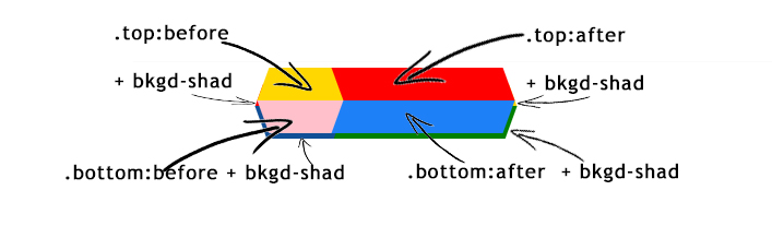
The following image explains what is what and how each element, pseudo elements and background-shadows are used to form the button. Pseudo elements and background-shadows are used to minimize markup:
HTML :
<div class="button top">
    <div class="button bottom"></div>
</div>
CSS :
.top{
    position:relative;
    margin-left:150px;
    width: 225px;
    height: 60px;
}
.button:before, .button:after{
    position: absolute;
    width:70%; height:50%;
    content: "";
    z-index:-1;
}
.top:before {
    left:0; top:0;
    -webkit-transform:skewX(-20deg);
    -ms-transform:skewX(-20deg);
    transform:skewX(-20deg);
    background: #469BF9;
    box-shadow: -5px 10px 0px -5px #104f96;
    z-index:-2;
}
.top:after {
    right:0; top:0;
    -webkit-transform:skewX(20deg);
    -ms-transform:skewX(20deg);
    transform:skewX(20deg);
    background: #469BF9;
    box-shadow: 5px 10px 0px -5px #104f96;
    z-index:-2;
}
.bottom:before{
    left:0; top:50%;
    -webkit-transform:skewX(20deg);
    -ms-transform:skewX(20deg);
    transform:skewX(20deg);
    background: #1E80F7;
    box-shadow: -4px 5px 0px 0px #104f96;
}
.bottom:after{
    right:0; top:50%;
    -webkit-transform:skewX(-20deg);
    -ms-transform:skewX(-20deg);
    transform:skewX(-20deg);
    background: #1E80F7;
    box-shadow: 4px 5px 0px 0px #104f96;
}
You may also check this codepen with a few different triangles.
Collected from the Internet
Please contact [email protected] to delete if infringement.
edited at
- Prev: Swipe delete button goes under custom UITableViewCell text
- Next: QML,How to dynamicaly change Item of Repeater from C++
Related
Related Related
- 1
Button with pointed edges and shadow
- 2
Removing the shadow from a button
- 3
how to create a button with shadow
- 4
Remove Button Shadow
- 5
Search button shadow
- 6
CSS Button shadow?
- 7
android button with half circle edges
- 8
SingularityGS: Why is the box-shadow missing at alpha and omega edges of of grid?
- 9
How to add shadow to reverse c radial gradient only at the edges?
- 10
How to soften/feather image edges using box-shadow in slideshow?
- 11
Inset box shadow faded/transparent on the left and right edges
- 12
Styling a CSS Button with Pointed Left Edge and Rounded Right Edge
- 13
How to remove button shadow (android)
- 14
Remove shadow effect on android button
- 15
Android elevation not showing shadow on Button
- 16
Android L FAB Button shadow
- 17
Drop and Inner shadow for button in javafx
- 18
No shadow, no outline, no border on active button
- 19
Remove button shadow in java (Android)
- 20
iOS Button with round corners and a shadow
- 21
Android elevation not showing shadow on Button
- 22
jquery mobile button text shadow
- 23
Display only the shadow to a button in HTML?
- 24
Removing shadow from button WPF
- 25
Android button shadow/margin top
- 26
Drop shadow for Floating Action Button
- 27
Material Design Button without Shadow
- 28
How to give shadow in a button like this?
- 29
bootstrap button circle shadow issue
Comments