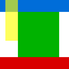
I want to position a DIV absolutely, at top: 0. The yellow div (#menu) in this diagram is the one in question.
I have HTML:
<html>
<head>
<link rel="stylesheet" type="text/css" href="style.css">
</head>
<body>
<div id="container_head">
</div>
<div id="container_body">
<div id="main">
<div id="menu">
</div>
<div id="content">
</div>
</div>
<div class="clear"></div>
</div>
<div id="container_foot">
</div>
</body>
</html>
and CSS:
#container_head {
    width: 100%;
    background-color: #00F;
    z-index: 10;
}
#container_body {
    width: 100%;
}
#container_foot {
    width: 100%;
    background-color: #F00;
}
#main {
    width: 960px;
    margin: 0 auto;
    position: relative;
}
#menu {
    background-color: rgba(255,255,0,0.5);
    width: 170px;
    padding: 10px;
    float: left;
    position: absolute;
    top: 0;
    z-index: 100;
}
#content {
    background-color: #0F0  ;
    width: 750px;
    padding: 10px;
    float: right;
}
.clear {clear: both;}
However, the yellow div does not appear at y position 0. Here is the fiddle.
Update
I appreciate the answers. I am still in a quandary. #container_head is not going to be the same height for every user. It is a responsive slider. Also, I need #menu to be on the left side of a region the same shape as #main, so it slots in next to #content.
After having read this thread, your comments and the updated question, it seems that you are not inclined to change your markup and layout. With this in mind let's fix only the styles to suit your existing markup.
Before you go on, have a look at this demo:
Demo: http://jsfiddle.net/abhitalks/2fYGj/6/
There are a few problems that we need to understand and we'll fix them one by one.
(1.) You have percent widths on containers and pixel widths on children. In your question you state that the containers esp. header needs be responsive. I would suggest using same units for the entire layout i.e. using percent widths for all your layout components.
(2.) You have paddings and margins applied to some elements which will cause problems on widths if you don't have proper box-sizing model to start with.
Let's fix these two problems:
We add a minimal reset to your CSS:
* {
    margin: 0; padding: 0; box-sizing: border-box;
}
We now apply percent widths to all elements:
#main {
    width: 100%;
    ...
}
#menu {
    width: 10%; /* within 100% of parent i.e. main */
    ...
}
#content {
    width: 70%; /* within 100% of parent i.e. main */
    ...
}
Now on to other problems:
(3.) You have percent widths on your container_head, container_body and container_foot. 100% width of what? It is of the parent. So we have to apply width to the html,body as well, to be on safe side.
We fix that by adding this to your CSS:
html, body {
    width: 100%;
}
(4.) You have your #menu absolutely positioned. Now, absolute position means taking the element out of flow and making it positioned relatively to its nearest relatively positioned parent. If no such parent exists, then it becomes relative to body. In your case, its immediate parent i.e. #main is relatively positioned, so the menu tried to position itself relative to #main. But, that's not what you want. You want it to be relative to #container_head. But #container_head is not in its parent hierarchy. (And you don't want to change your markup) otherwise adding a wrapper would have solved this problem.
So we fix this by removing position: relative on #main:
#main {
    ...
    /* position: relative;  <-- Remove positioning from main */
}
This will force the #menu to be positioned relative to page. This will introduce another problem, which is that if you have a margin-top applied to #container_head, then the menu will pull up. To mitigate that, you will then have to apply a top on #menu which is equal to the margin-top of #container_head. (This can be best understood by this demo: http://jsfiddle.net/abhitalks/LbRKb/)
(5.) You need your #menu to line-up with the #content. And #menu is absolutely positioned. Absolute position means it is out of its flow and hence your floats on menu and content are now meaningless.
We fix it by assigning a percent margin to both menu and content:
#menu {
    width: 10%;
    top: 0; left: 10%; /* whatever indent you want from left */
    /* float: left <-- not required now */
    ...
}
#content {
    width: 70%;
    margin-right: 10% /* right margin equal to left pos of menu */
    margin-left: 20%; /* left margin equal to left pos of menu + menu width */
    /* float: right <-- not required now */
    ...
}
(6.) Because your menu is absolutely positioned now, its height may exceed that of #main if there is little or no content in #content. In that scenario it will overlap main into the footer and even beyond.
We fix this by assigning a min-height to both #menu and #main and making sure that main's height is more than that of menu:
#main {
    min-height: 200px; /* must be more than that of menu */
    ...
}
#menu {
    min-height: 100px;
    ...
}
.
There you go. Now you have a layout that exactly resembles the diagram picture you posted.
In order to constrain the menu and content size using max-width, the above method will break the gap between menu and content as mentioned by the Op in the comments below.
To fix this turned out to be easy. The trick would be to use right instead of left on the #menu.
Demo 3: http://jsfiddle.net/abhitalks/2fYGj/17/ Demo 3 (Full-Screen): http://jsfiddle.net/abhitalks/2fYGj/17/embedded/result/
Hope that helps.
.
Collected from the Internet
Please contact [email protected] to delete if infringement.
Comments