How to get parent element to grow with content using JQuery
NaN
I cannot seem to get this just right. I've been all over trying to find a solution to be able to have 3 inline-block elements that will grow to the tallest content with vertical borders. It's the borders that are making this so difficult. If I didn't need the borders, I'd be fine but I can't do without them.
What I have works, sort of... If I resize the browser window, and the left element is the tallest, everything looks fine; the borders are all 100% and the parent div grows with the content inside.
However, if the center or the right div have the tallest content, the vertical borders fall short of 100%. I thought to fix this I would give the middle and right elements a 100% height. This does bring the borders to the ground when I resize but now, the parent no longer grows with the tallest element and the content bleeds out. please see the attached pic.
Can someone please help me get this fixed? Live on JSBin
<!DOCTYPE html>
<html>
  <head>
    <style>
      #wrapper {
        float:left;
        width:100%;
        border-top:1px solid #000;
        border-bottom:2px solid #000;
      }
      #wrapper .col {
        float:left;
        width:33%;
        display:inline-block;
      }
      #wrapper .col:nth-child(1) {
        border-right:2px solid #000;
     }
      #wrapper .col:nth-child(2) {
        border-right:2px solid #000;
        height:100%;
      }
      #wrapper .col div {
        padding:10px;
      }
    </style>
    <script src="http://ajax.googleapis.com/ajax/libs/jquery/1.11.0/jquery.min.js"></script>
    <script>
      $(window).on('load resize', function(){
        var $div = $('#wrapper .col');
        var max = 0;
        $.each($div, function(){
          if(parseInt($(this).outerHeight()) > max){
            max = parseInt($(this).outerHeight())
            $("#wrapper").css('height', max + 'px');
          }
        });
      }).resize();
    </script>
  </head>
  <body>
    <div id="wrapper">
      <div class="col">
1<br>
1<br>
1<br>
      </div>
      <div class="col">
1<br>
1<br>
1<br>
1<br>
1<br>
1<br>
1<br>
1<br>
      </div>
      <div class="col">
1<br>
1<br>
      </div>
    </div>
  </body>
</html>
This is what it looks like: 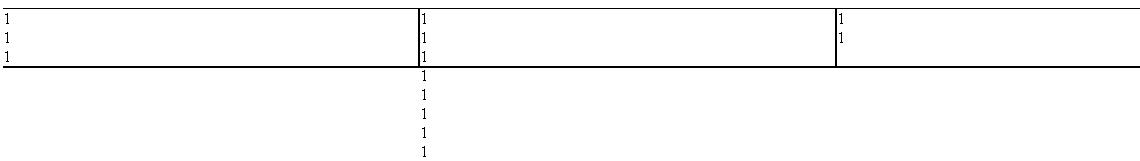
EDIT:
I'd like to add that if anyone has a better way to achieve what I'm trying to do, I'm very open.
wf4
You don't need javascript to do this, you can do it using html and css.
http://jsfiddle.net/wf_4/Puu3u/
css:
 #wrapper {
    width:100%;
    border-top:1px solid #000;
    border-bottom:2px solid #000;
    display:table;
  }
  #wrapper .col {
    width:33%;
    display:table-cell;
  }
  #wrapper .col:nth-child(1) {
    border-right:2px solid #000;
 }
  #wrapper .col:nth-child(2) {
    border-right:2px solid #000;
  }
  #wrapper .col {
    padding:10px;
  }
HTML:
<div id="wrapper">
    <div class="col">
       1<br />
       1<br />
       1<br />
    </div>
    <div class="col">
       1<br />
       1<br />
       1<br />
       1<br />
       1<br />
       1<br />
       1<br />
       1<br />
    </div>
    <div class="col">
       1<br />
       1<br />
    </div>
</div>
Collected from the Internet
Please contact [email protected] to delete if infringement.
edited at
- Prev: Apps Script Gadget on Google Site started throwing CORS errors
- Next: php/webstorm toogle auto-test is triggered without saving a file
Related
Related Related
- 1
How to get parent element using jquery
- 2
How to get the sibling element of a parent element using jQuery
- 3
How to get parent element in jquery?
- 4
How to get the html content of a clicked element using jQuery
- 5
get parent element by class using jquery
- 6
get parent element by class using jquery
- 7
How to get index of element by parent in JQuery
- 8
How to load the content of <h> element using jquery
- 9
jquery how to get the parent text using chlid?
- 10
Get value of data attribute using jQuery in parent element
- 11
Get the grand parents of html element using jquery .parentsUntil() or parent()
- 12
Unable to get the second Parent of my Input element using jquery
- 13
How to get the parent of an element
- 14
How to get parent element?
- 15
How to get parent of an element?
- 16
How to get the parent of an element
- 17
How to get parent element?
- 18
how to get the content which is pasted using jquery
- 19
jQuery get parent Element and hide it
- 20
Get child element of parent with jquery
- 21
JQuery hiding parent element if div has no content
- 22
How to get parent group content from svg using javascript?
- 23
How to get child element of another child of the same parent with jQuery/JS
- 24
get the content of the prev element jquery
- 25
Get the parent element html along with child content
- 26
How to get index of match element using jquery
- 27
How to get a specific element using jquery?
- 28
How to get html element id using jquery
- 29
How to get first number in element using jQuery
Comments