如何用对角线和对角线文本绘制HTML表?
爱德华多·乌斯塔雷斯
我怎样才能使用html5和css3绘制这种表格的任何建议?
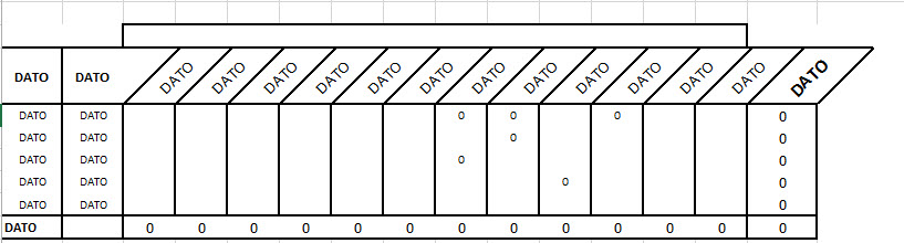
我尝试过这个,我认为那太复杂了:对角线和对角文字
我正在使用css3样式和svg html5标记,还有其他方法可以制作这种html表吗?
<div style='width: 300px; height: 100px; display: flex; flex-direction: row-reverse;'>
<div style='width: 100px; height: 100px; border-top: 2px solid rgb(255,0,0); position: relative;'>
<svg style='width: 100%; height: 100%; position: absolute;'>
    <line x1="0" y1="100%" x2="100%" y2="0"
        style="stroke:rgb(255,0,0);stroke-width:2"/>
</svg>
    <div style='margin-left:-40px; margin-top:25px; width: 80px; height: 30px; font-size:19px; background-color: yellow; -ms-transform: rotate(315deg); /* IE 9 */
    -webkit-transform: rotate(315deg); /* Chrome, Safari, Opera */
    transform: rotate(315deg);'>DATO3</div>
</div>
<div style='width: 100px; height: 100px; border-top: 2px solid rgb(255,0,0); position: relative;'>
<svg style='width: 100%; height: 100%; position: absolute;'>
    <line x1="0" y1="100%" x2="100%" y2="0"
        style="stroke:rgb(255,0,0);stroke-width:2"/>
</svg>
    <div style='margin-left:-45px; margin-top:25px; width: 80px; height: 30px; font-size:19px; background-color: yellow; -ms-transform: rotate(315deg); /* IE 9 */
    -webkit-transform: rotate(315deg); /* Chrome, Safari, Opera */
    transform: rotate(315deg);'>DATO2</div>
</div>
    <div style='width: 100px; height: 100px; border: 0px solid black; position: relative;'>
<svg style='width: 100%; height: 100%; position: absolute;'>
    <line x1="0" y1="100%" x2="100%" y2="0"
        style="stroke:rgb(255,0,0);stroke-width:2"/>
</svg>
    <div style='margin-left:-40px; margin-top:25px; width: 80px; height: 30px; background-color: white; -ms-transform: rotate(315deg); /* IE 9 */
    -webkit-transform: rotate(315deg); /* Chrome, Safari, Opera */
    transform: rotate(315deg);'></div>
</div>
    </div>
<div style='width: 300px; height: 100px; display: flex; flex-direction: row-reverse;'>
<div style='width: 100px; height: 100px; border-top: 0px solid black; position: relative;'>
<svg style='width: 100%; height: 100%; position: absolute;'>
    <line x1="0" y1="100%" x2="0%" y2="0"
        style="stroke:rgb(255,0,0);stroke-width:3"/>
</svg>
</div>
    <div style='width: 100px; height: 100px; border-top: 2px solid rgb(255,0,0); position: relative;'>
<svg style='width: 100%; height: 100%; position: absolute;'>
    <line x1="0" y1="100%" x2="0%" y2="0"
        style="stroke:rgb(255,0,0);stroke-width:3"/>
</svg>
</div>
<div style='width: 100px; height: 100px; border-top: 2px solid rgb(255,0,0); position: relative;'>
<svg style='width: 100%; height: 100%; position: absolute;'>
    <line x1="0" y1="100%" x2="0%" y2="0"
        style="stroke:rgb(255,0,0);stroke-width:3"/>
</svg>
</div>
</div>
先生
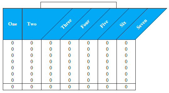
主要构建块是:
一个很好的标记
<table>具有基本形状的偏斜伪元素边框
在包含标题文本的跨度上旋转。
该概念非常基础,使用来定位伪元素和跨度,position: absolute并且它们相对于其父<th>标头位于position: relative
这是在Chrome / Firefox / IE10 +中的外观。IE 8-9应该使用其专有的过滤器。
这是HTML / CSS:
* {
    margin: 0;
    padding: 0;
}

body {
    background: #FFF;
}
table {
    border-collapse: collapse;
    margin: 50px 0 0 50px;
    border-top: solid 1px #000;
    position: relative;
}

/* Very top border */
 table:before {
    content:'';
    display: block;
    position: absolute;
    top: -20px;
    left: 120px;
    height: 20px;
    width: 240px;
    border: solid 1px #000;
    border-bottom: none;
}

/* Far right headers top border (it's outside the table) */
 table:after {
    content:'';
    display: block;
    position: absolute;
    border-top: solid 1px #000;
    width: 101px;
    right: -101px;
    top: 0;
}

/*
     - Apply header background/font colour
     - Set base z-index for IE 9 - 10
*/
 thead, th:before {
    background: #03a9f4;
    color: #FFF;
    z-index: 1;
}

/* min-width and max-width together act like a width */
 th {
    min-width: 60px;
    max-width: 60px;
    position: relative;
    height: 100px;
}

/* Pseudo element borders */
 th:before {
    content:'';
    display: block;
    position: absolute;
    top: 0;
    right: -50px;
    height: 100px;
    width: 60px;
    border: solid 1px #000;
    border-right: none;
    border-top: none;
    transform: skew(-45deg);
    border-bottom: none;
}

/* Apply the right border only to the last pseudo element */
 thead th:last-child:before {
    border-right: solid 1px #000;
}

/* Apply the top border only to the first rows cells */
 tbody tr:first-child td {
    border-top: solid 1px #000;
}

/*
     - Rotate and position headings
     - Padding centers the text vertically and does the job of height
     - z-index ensures that the text appears over the background color in IE 9 - 10
*/
 th span {
    transform: rotate(-45deg);
    display: inline-block;
    vertical-align: middle;
    position: absolute;
    right: -70px;
    bottom: 29px;
    height: 0;
    padding: 0.75em 0 1.85em;
    width: 100px;
    z-index: 2;
}

/* Create first two th styles */
 th:nth-child(1), th:nth-child(2) {
    border: solid 1px #000;
    border-top: none;
    border-bottom: none;
}
th:nth-child(2) {
    border-right: none;
}
th:nth-child(1):before, th:nth-child(2):before {
    display: none;
}

td {
    border: solid 1px #000;
    border-bottom: none;
    border-top: none;
    height: 20px;
    text-align: center;
}
tfoot {
    border: solid 1px #000;
}
<table>
<thead>
<tr>
<th>One</th>
<th>Two</th>
<th><span>Three</span></th>
<th><span>Four</span></th>
<th><span>Five</span></th>
<th><span>Six</span></th>
<th><span>Seven</span></th>
</tr>
</thead>
<tbody>
<tr>
<td>0</td>
<td>0</td>
<td>0</td>
<td>0</td>
<td>0</td>
<td>0</td>
<td>0</td>
</tr>
</tbody>
<tfoot>
<tr>
<td>0</td>
<td>0</td>
<td>0</td>
<td>0</td>
<td>0</td>
<td>0</td>
<td>0</td>
</tr>
</tfoot>
</table>本文收集自互联网,转载请注明来源。
如有侵权,请联系[email protected] 删除。
编辑于
相关文章
Related 相关文章
- 1
如何用对角线和对角线文本绘制HTML表?
- 2
如何绘制对角线div?
- 3
如何使用CSS绘制对角线
- 4
如何使用MSChart对角线绘制带状线?
- 5
视线对角线
- 6
映射对角线
- 7
如何使对角线和反向对角线与2D矩阵中的点交叉?
- 8
用对角线绘制UIView?
- 9
用Java绘制对角线
- 10
绘制我的matplotlib散点图的对角线?
- 11
如何用对角线div制作形状?
- 12
在 Android 中只绘制水平、垂直和对角线
- 13
在html5中绘制对角线
- 14
如何绘制线性渐变的完美对角线
- 15
如何绘制线性渐变的完美对角线
- 16
如何在Graphviz中绘制对角线边缘
- 17
如何在PHP中编写对角线文本
- 18
数组的numpy和反对角线
- 19
求数组对角线和的错误
- 20
在HTML中显示对角线分数
- 21
使用 html 和 css 创建对角线
- 22
我如何对角线跨表的SQL总和?
- 23
如何制作对角线div
- 24
如何对角线分割图像?
- 25
如何检查主教的空对角线?
- 26
如何制作对角线div
- 27
如何找到对角线值
- 28
主对角线变成反对角线
- 29
更改矩阵中心对角线旁边的对角线
我来说两句