高度限制为屏幕大小的自适应内容
盖刷
在过去的几天里,我正在按照一个简单的分步教程布局(html / css)进行操作,但我无法使其具有响应能力,并且无法同时限制其屏幕大小。
这是我到目前为止的工作,以及我正在尝试做的事情:

HTML:
<div id="tutorial">
  <h1>Step 2 - Title</h1>
  <h3>Second step description / instructions</h3>
  <div id="content">
    <div id="ctrls">
      <img src="images/prev.png">
      <img src="images/stop.png">
      <img src="images/next.png">
    </div>
    <div id="image">
      <img src="images/step2.jpg">
    </div>
  </div>
  <div id="controls">
    <div class="btn prev">
      <img src="images/btn_prev.png">
    <div class="btn next">
      <img src="images/btn_next.png">
    </div>
  </div>
</div>
CSS:
* {
    margin: 0;
    padding: 0;
}
html, body {
    overflow: hidden;
    font-family: Arial;
}
#tutorial {
    width: 100%;
    height: 100vh;
    background-color: #FFFFCC;
}
h1 {
    padding: 20px;
    font-size: 26px;
    font-weight: bold;
    text-align: center;
}
h3 {
    font-size: 20px;
    text-align: center;
    font-weight: normal;
}
#content {
    display: table;
    margin: 0 auto;
    padding: 16px;
    height: calc(100vh - 220px);
    background-color: #E6E6E6;
}
#content #image {
    position: relative;
}
#content #image img {
    width: 100%;
    height: 100%;
    max-height: 100%;
}
#content #ctrls {
    position: absolute;
    z-index: 99;
    display: table;
    padding: 2px;
}
#content #ctrls img {
    width: 48px;
    height: auto;
    float: left;
}
#controls {
    display: table;
    margin: 4px auto;
}
#controls .btn {
    margin-top: 6px;
    float: left;
}
#controls .prev {
    margin-right: 10px;
}
#controls .next {
    margin-left: 10px;
}
#controls .off {
    opacity: 0.4;
    filter: alpha(opacity=40);
}
#controls .btn img {
    border: 0;
}
感谢您的任何帮助!
Alexander Masan
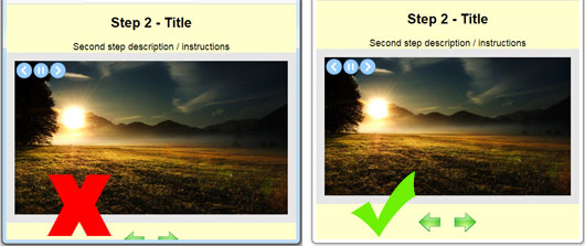
试试这个变体。我稍微重写了您的代码... https://codepen.io/opmasan/pen/jObdmdd
:root {
  --header-height: 100px;
  --footer-height: 200px;

}

*{
    margin: 0;
    padding: 0;
}
html, body {
    font-family: Arial;
}
#tutorial {
    width: 100%;
    height: 100vh;
    background-color: #FFFFCC;
    display: flex;
    flex-direction: column;
    justify-content: center;
    align-items: center;
}
h1 {
    padding: 20px;
    font-size: 26px;
    font-weight: bold;
    text-align: center;
}
h3 {
    font-size: 20px;
    text-align: center;
    font-weight: normal;
}
#content {
    display: flex;
    padding: 16px;
    background-color: #E6E6E6;
}
#content #image {
    position: relative;
}
#content #image img {
    height: calc(100vh - var(--header-height) - var(--footer-height));
    max-height:100%;
    max-width: 100%;
    object-fit: cover;
}
#content #ctrls {
    position: absolute;
    z-index: 99;
    width: 100px;
    height: 50px;
    background-color: #3AE2CE;
}
#controls {
    display: flex;
    margin: 4px auto;
}
#controls .btn {
    margin-top: 6px;
    float: left;
}
#controls .prev {
    margin-right: 10px;
}
#controls .next {
    margin-left: 10px;
}
#controls .off {
    opacity: 0.4;
    filter: alpha(opacity=40);
}
本文收集自互联网,转载请注明来源。
如有侵权,请联系[email protected] 删除。
编辑于
相关文章
Related 相关文章
- 1
如何将列最大高度限制为屏幕高度?即让孩子“match_parent”大小
- 2
将元素高度限制为内容,并保持折叠的溢出
- 3
将下拉列表的最大高度限制为jQuery中的屏幕高度
- 4
将下拉列表的最大高度限制为jQuery中的屏幕高度
- 5
iFrame的高度限制为150像素
- 6
如何根据内容将元素高度限制为特定值(“阶梯式”)
- 7
将子div的高度限制为父容器的高度
- 8
基于动态内容的webView高度限制
- 9
如何使用MVVM模式将窗口的高度限制为屏幕分辨率的百分比?
- 10
有什么方法可以将超大屏幕中的图像高度限制为超大屏幕中的图像高度吗?
- 11
显示的字符数限制或内容的高度限制
- 12
WPF网格-以最小高度限制自动调整大小
- 13
高度自适应容器
- 14
在显示具有较大选择列表的自适应卡时(在botframework中),来自bot的大小限制(限制为262144字节)出现问题
- 15
WordPress摘录高度限制
- 16
使用Google响应式添加将页脚高度限制为100像素
- 17
CSS图像高度限制为父div高度。父级div的宽度和高度以百分比指定***
- 18
CSS图像高度限制为父div高度。父级div的宽度和高度以百分比指定***
- 19
自适应数字标牌(高度)
- 20
自适应网页-设计高度
- 21
自适应/等于div高度
- 22
自适应iframe高度不足
- 23
根据最大宽度和最大高度限制图像大小
- 24
自适应大小调整
- 25
CENTERED HTML内容框有宽度和高度限制吗?
- 26
CSS自适应文本内容
- 27
调整按钮大小以适应任何屏幕的限制 - Xcode swift
- 28
以编程方式更改高度限制
- 29
通过UITextView高度限制字符
我来说两句